Paper 2
Core Human Geography: 1 hour 30 minutes
Section A: Three data response questions (30 marks)
Section B: One structured question from a choice of three (30 marks)
60 marks
AS Level 50% A Level 25%
4.1 Natural Increase as a Component of Population Change
Visit the world population clock here. Record the current population, population growth today and population growth this year. You are going to look back at this at the end of the topic so write is somewhere safe!
Early Humankind
- First hominoids appeared in Africa around 5 million years ago (the planet is generally accepted to be around 4600 million years old!)
- They differed from their predecessors – the apes – in that they walked on only 2 legs and did not use their arms to bear weight
- The global population was very small – a million years ago it was probably somewhere around 125,000 people!
- Around 10,000 years ago people started to domesticate animals and cultivate crops and the world population would have been no more than 5 million
- The Neolithic Revolution occurred at this time and the relationship between people and the environment changed considerably, but population growth was around 0.1% per year. This represents a natural increase of 1 per 1000.
Natural Increase (or decrease) – is the difference between the birth rate and the death rate.
Carrying Capacity – the number of people, animals, or crops which a region can support without environmental degradation.
- As technological advances were made, the carrying capacity of the land increased
- By 3500 BCE, global population had reached 30 million
- By 0 CE this has risen to about 250 million (not too far off the population of Indonesia today which has just over 273 million people!)
- Demographers (people that measure population and its make up) estimate that it took until 1650 for the world population to grow to 500 million
- From then on population began to grow much more rapidly:
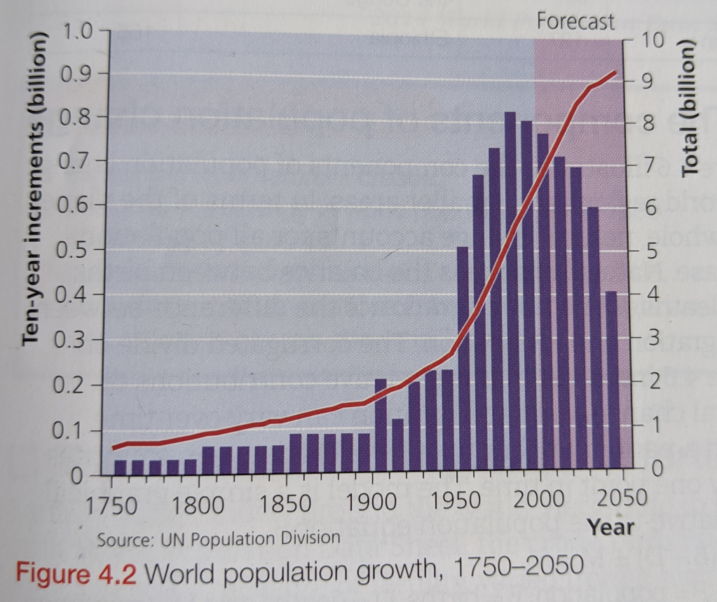
Use Figure 4.2 to continue the description of world population growth between 1750 and the predicted growth to 2050.
| Each Billion | Year | Number of years to add a billion |
| 1st | 1800 | All of human history |
| 2nd | 1930 | 130 |
| 3rd | 1960 | 30 |
| 4th | 1974 | 14 |
| 5th | 1987 | 13 |
| 6th | 1999 | 12 |
| 7th | 2011 | 12 |
| 8th | c.2024 | Expected to be 13 |
Recent Demographic Change
Since the second World War, population and the rate of population growth have been much higher in low-income countries (LICs) than in high-income countries (HICs). HICs has their period of high population growth in the nineteenth and early twentieth centuries, while for LICs the growth has occurred since 1950.
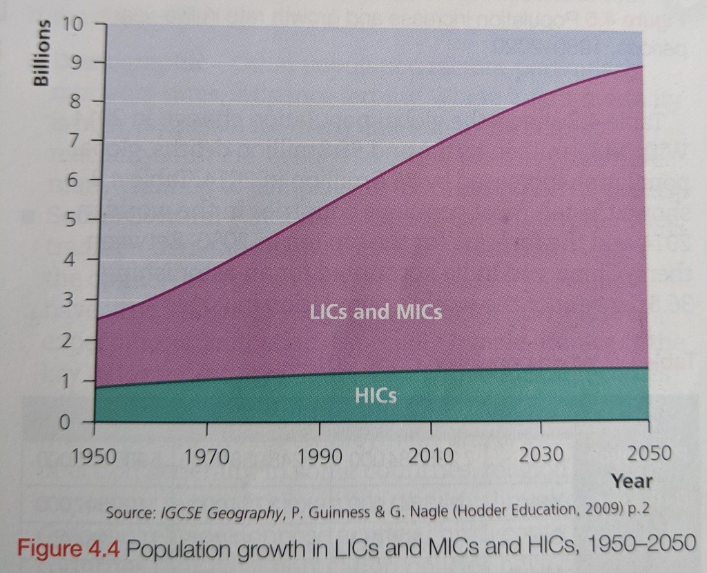
The global population growth rate was highest in the early to mid-1960s, when population growth peaked at 2.4% per year. The term ‘population explosion’ was widely used to describe this rapid population growth, but by the 90s it had reduced to 1.8%.
Population momentum – is when even after the country reaches replacement-level fertility (just over two children per woman) the population of a country will continue to grow for a number of years.
Due to population momentum, although the growth rate had been falling for three decades the actual population numbers did not peak until the late 1980s.
Demographic transformation has taken varying periods of time. For HICs it took over a century, but there are countries who have progressed much more rapidly in more recent times. Fertility has dropped further and faster than most demographers anticipated20-30 years ago.
Africa is an exception to this, where in over 20 countries (Africa is a continent made up of 54 countries), families of at least 5 children are the norm and population growth remains at around 2.5% – a very high rate of natural increase.
Define the terms natural increase and population momentum in your own words. Describe and explain the trends in the graph below which shows the population increase and growth rate in five-year periods from 1980-2020.

The Components of Population Change

The model above is a simple graphical alternative to the population equation:
P = (B-D)±M where P = Population, B= births, D=deaths and M=migration.
So, this illustrates the components of population change for world regions and smaller areas. In terms of the planet as a whole, natural change accounts for all population increase.
Natural change is the balance between births and deaths.
Net migration is the difference between immigration and emigration. (Obviously this wont exist on a planetary scale until we can populate Mars!!)
Natural change can be stated in absolute or relative terms:
Absolute natural change gives the actual change in population as a result of the difference between the number of births and the number of deaths, for example a number such as 200,000.
Relative natural change is expressed as a rate per thousand, for example 3/1000.

Discuss the global variations in birth rate, death rate and rate of natural change shown in the table above.
The factors affecting levels of fertility
Fertility varies widely around the world. In 2014 the crude birth rate varied from 50/1000 in Niger to 6/1000 in Monaco. The word ‘crude’ means that the birth rate applies to the total population, taking no age or gender into account. The crude birth rate is heavily influenced by the age structure of a population. The crucial factor is the percentage of young women of reproductive age, as it is obviously these women who produce the most children.
For more accurate measures of fertility, the ‘fertility rate’ and ‘total fertility rate’ are used.
Fertility rate – the number of live births per 1000 women aged 15-49 years in a given year.
Total fertility rate – average number of children that would be born alive to a woman during her lifetime, if she were to pass through her childbearing ears conforming to the age-specific fertility rates of a given year.
The total fertility rate varies from a high of 7.6 in Niger to a low of 1.1 in Taiwan.

Describe and explain the differences in fertility by world region shown in the table above.
The map below shows the variation of fertility rate by country around the world.

Factors affecting fertility rate:
- Demographic – other population factors, particularly mortality rates, influence fertility. Where infant mortality is high, it is usual for many children to die before reaching adult life. In such societies, parents often have many children to compensate for these expected deaths.
- Social/Cultural – in some societies, particularly in Africa, tradition demands high rates of reproduction. Here, the opinion of women in their reproductive years is not as important as the cultural demands and expectations. Education, particularly female literacy, is the key to lower fertility rates. With education comes knowledge of birth control, greater social awareness, more opportunity for employment and therefore wider choices in general. Muslim and Roman Catholic religions oppose birth control, so this is a factor in countries dominated by those religions. Most countries have population policies which promote the use of birth control to reduce their fertility rate. There is often significant difference even between neighbourhoods and this can be put down quite simply to wealth.
- Economic – in many LICs children are seen as economic assets because of the work they do and also because of the support they are expected to give their parents in old age. In HICs the general perception is reversed – the cost of child dependency is a major factor in the decision to begin or extend a family. Economic growth allows greater spending on health, housing, nutrition and education, which is important in lowering mortality and thus reducing fertility. The nature of employment can also have an impact on fertility as many companies, particularly in HICs, do not want to lose valuable female workers and therefore provide childcare and often offer flexible working hours.
- Political – There are many examples in the last century of governments attempting to change the rate of population growth by implementing population policies. In the 1930s, Germany, Japan and Italy all offered inducements and concessions to those with large families. In more recent years, Malaysia has adopted a similar policy which was implemented in the 1980s encouraging the population to reach 70 million in order to become self sustaining. However, today most governments offer incentives to reduce population growth instead.
- Health – general health factors such as being over or underweight or using drugs, alcohol and tabacco may also have an impact, as can being exposed to environmental hazards such as radiation, toxic chemicals or microwave emissions. Any of these factors can reduce a woman’s fertility.
Although these factors do not directly impact on fertility, they do impact another set of variables that determine the rate and level of childbearing. The intermediary factors can be seen below:

Fertility Decline
In 2010 the UN published a document predicting that global population would peak at 10.1 billion in 2100, after reaching 9.3 billion by the middle of this century.
The global peak population has been continually revised downwards in recent decades as many countries show significantly declining fertility rates.
A fertility of 2.1 children per woman is replacement level, below which populations will eventually (allowing for population momentum) start to fall. A half-century ago six countries – Czechia, Estonia, Hungary, Japan, Latvia and Ukraine, 5 percent of the world’s population – reported fertility rates slightly below replacement level. Today a record high of 83 countries, representing about half of the world’s population, report below-replacement level rates. By 2050 more than 130 countries, or about two-thirds of the world’s population, are projected to have fertility rates below replacement level. The movement to replacement level fertility is one of the biggest social changes in history; it allows women to work and children to be educated.
1.How can (a) government policies and (b) religious philosophies influence fertility? 2.Why is replacement level fertility an important concept? 3.Discuss the importance of three of the intermediate variables shown in Fig. 4.
The factors affecting mortality
Like crude birth rate, crude death rate is a very generalised measure of mortality. It is heavily influenced by the age structure of a population. For example, the crude death rate for the UK is 9/1000 compared with 6/1000 in Brazil. However, life expectancy at birth in the UK is 81 years, compared with 75 years in Brazil. Brazil has a much younger population than the UK, but the average quality of life is significantly higher in the UK.

Crude death rate – the ratio of the number of deaths during the year to the average population in that year; the value is expressed per 1000 inhabitants. eg. 9/1000
Quality of life – the standard of health, comfort, and happiness experienced by an individual or group.
In 2014 the highest crude death rate was in Lesotho at 21/1000 and it was lowest in the UAE and Qatar where it was 1/1000.
Infant mortality rate – the number of deaths per 1,000 live births of children under one year of age.
Life expectancy at birth – the average period that a person is expected to live measured from birth
Causes will vary considerably between LICs and HICs. Read through the list below and write down how you think each factor will differ based on the economic level of the country.
- Age distribution – The higher the proportion of old people to young people, the higher the death rate since older people are more likely to die.
- Gender – Women generally have a higher life expectancy than men, possibly due to the lifestyle or biological differences preventing certain diseases.
- Occupation – In some countries people may be employed in dangerous occupations increasing the death rate e.g. Timber cutters in America with 105 deaths in 2000.
- Income – Low income levels correlate to a low life expectancy whilst high income levels correlate with a high life expectancy. This is because a high income allows people to afford medical care, higher standards of living and healthier foods, prolonging their life.
- Literacy – Areas with high literacy levels have higher life expectancies whereas areas with low literacy rates have low life expectancies. The reasoning behind this is that when people can read & write, they can obtain higher paying jobs and therefore receive a higher income improving their life expectancy. In addition, when people can read they can read information on preventing the spread of disease and basic hygiene standards improving life expectancy.
- Access to food – Countries with a lack of food have low life expectancies since the people suffer from malnutrition and are more susceptible to diseases due to a weakened immune system increasing the mortality rates.
- Medical Facilities – Access to vaccination programs helps to prolong life expectancy and prevent the spread of diseases. Equipment such as mosquito nets also help prolong life expectancy. Access to medical clinics and doctors will also help to substantially lower the death rate. Access to and usage of these services is dependant on income and literacy rates however.

Besides challenges of the physical environment, LICs also face a range of social and economic factors that contribute to the high rates of infectious diseases including:
- poverty
- poor access to healthcare
- antibiotic resistance
- evolving human migration patterns
- new infectious agents
When people live in overcrowded, unsanitary conditions, communicable diseases such as tuberculosis and cholera can spread rapidly. Limited access to healthcare and medicines means that otherwise curable diseases,such as malaria, become killers. Poor nutrition and deficient immune systems are also key risk factors involved in the deaths of many from conditions such as lower respiratory infections, tuberculosis and measles.
Variations within countries are due to:
- social class
- ethnicity
- place of residence
- occupation
- age structure of the population
1.To what extent does infant mortality vary around the world? 2.Discuss the main reasons for such large variations in infant mortality. 3.Research and describe the global variations in life expectancy
The interpretation of age/sex structure diagrams
Use the following worksheet to learn how to read a population pyramid:
Task sheet for population pyramids:
Starter: Click here to be taken to a population pyramid of France this year. Study it carefully and then describe why the French President needs to raise the retirement age by two years for French workers.
Task 1 – Watch the video and explain the features of the Age Sex Structure for France. What does the term ‘spinning top’ refer to?
Task 2 – Have a play with this population pyramid site – check out your own country.
Screen shot the pyramid for when you were born, for when you will be 50 and for when you will be 100 (maybe!)
Then write a few sentences to explain what future population growth / decline is going to be like there.
Country with a high level of economic development – France ** Tasks can be completed on worksheet**
i. Choose France and the year 1950. Explain the indentations 25-39 years old and 5-19 years old.
ii. What was the population of France in 1950?
iii. What is the population of France now?
iv. Describe the structure of the pyramid for France this year and include a screen shot under your explanation.
v. What are the key population issues facing France today?
vi. What percentage of the population will be over the age of 60 years old in the year 2050?
vii. Is France becoming a country with a youthful or ageing population? Explain your answer.
Country with a lower level of economic development – Gambia ** Tasks can be completed on worksheet**
i. Using the same tool, choose Gambia and the year 1950. Note the total population in 1950.
ii. What is the population of Gambia now?
iii. Approximately, how many times more is the population than in 1950?
iv. Describe the structure of the pyramid for Gambia this year and include a screen shot under your explanation.
v. What are the key population issues facing Gambia today?
vi. How is the population structure of Gambia going to change by the year 2050?
vii. Is Gambia becoming a country with a youthful or ageing population? Explain your answer.

Describe and explain the differences between the four diagrams above [6 marks]
Population structure: differences within countries
The ratio between the number of males and females in a society is referred to as the gender ratio. This ratio is not stable but instead shaped by biological, social, technological, cultural, and economic forces. And in turn the gender ratio itself has an impact on society, demography, and the economy.
Sex ratio is the number of males per 100 females in the population.
In 2014, the global sex ratio at birth was estimated to be 107 boys to 100 girls. Male births consistently exceed female births for a combination of biological and social reasons. For example, more families decide to complete their family on the birth of a boy than of a girl. However, after birth the gap decreases due to female mortality being lower than male mortality at every age. In LICs the gap can be closed in less than a year.
In China 2010 it is believed that there were 118 male births for every 100 females due to a high number of female foetuses aborted by parents intent on having a son. Even within countries this ratio can vary significantly due to different cultural demands in different parts of the country.
Dependency Ratio
Age dependency ratio is the ratio of dependents–people younger than 15 or older than 64–to the working-age population–those ages 15-64. Data are shown as the proportion of dependents per 100 working-age population.
Quick Graphing Task – Using this link from the World Bank, create a comparative chart that shows the positions of each of 6 countries in terms of their total dependency ratio (see colour coding key below). You should plot the data from 1995, 2005 and 2015.
Now complete the Dependency Ratio worksheet:
Ageing Ratio
Age dependency ratio, old, is the ratio of older dependents–people older than 64–to the working-age population–those ages 15-64. Data are shown as the proportion of dependents per 100 working-age population.
Quick Graphing Task – Using this link from the World Bank, create a comparative chart that shows the positions of 6 countries in terms of their ageing ratio (see colour coding key below). You should plot the data from 1995, 2005 and 2015.
Now complete the Ageing Ratio worksheet:
Using five screenshots from the video above, write an account of the view expressed by Hans Rosling in the video above. Do you agree with his viewpoint given the work you have completed so far. Target 500 words.
Past Paper Question
The graph below shows actual total fertility rate (TFR) and predicted TFR for selected LICs/MICs.
(a) State the actual TFR and the predicted TFR for Rwanda shown in the graph. [2]
(b) Describe the relationship between TFR and levels of development, using data from the graph below. [4]
(c) Outline two factors which help to explain why fertility rates are decreasing in many countries. [4]
[Total: 10]
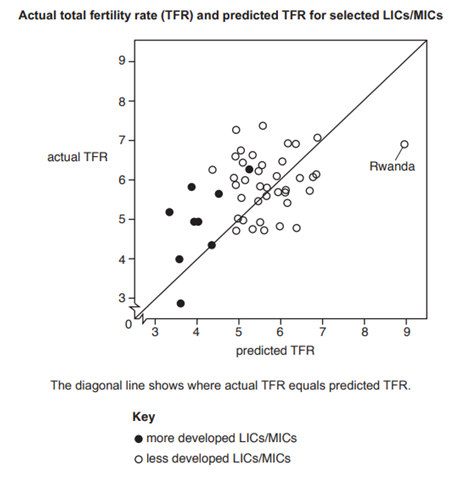
Nov 2018/21

One thought on “Core Human Geography: Population”